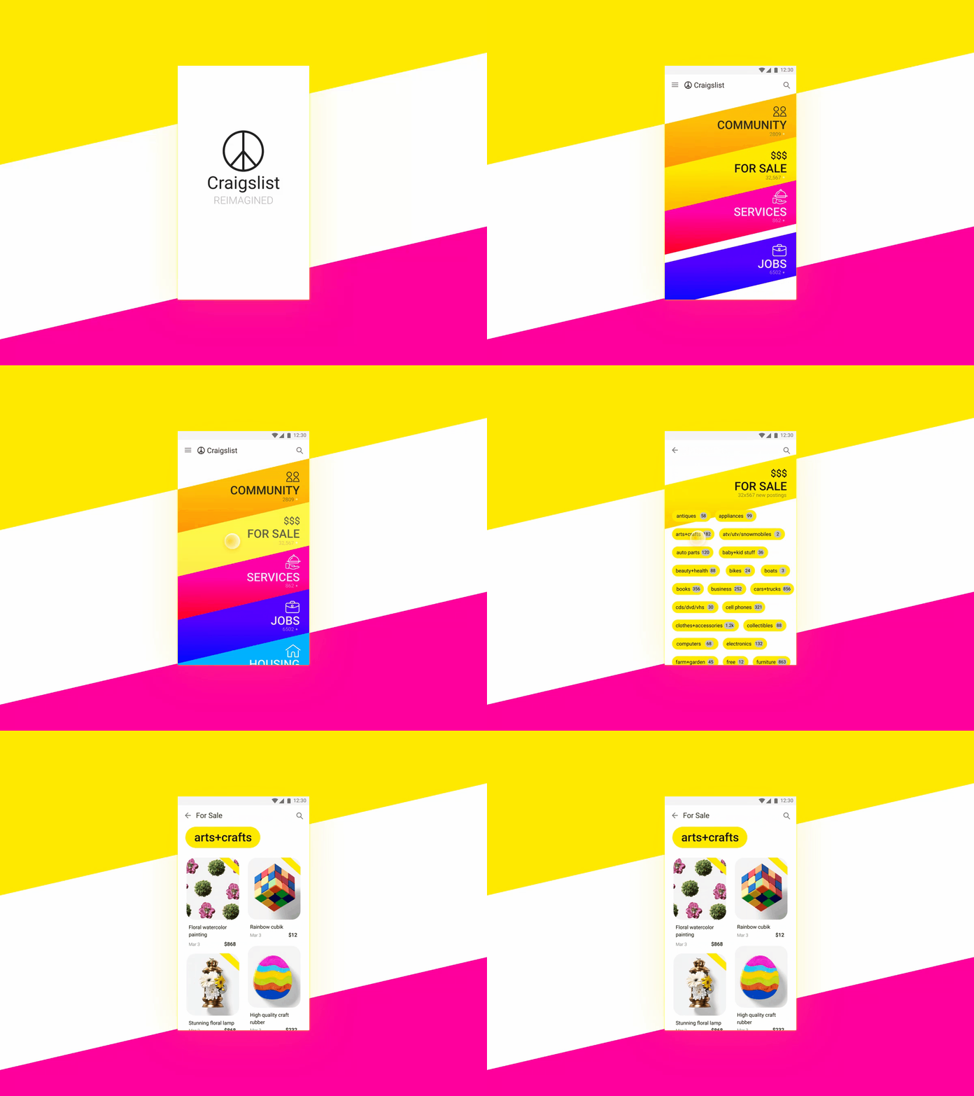
Here's one of my take for the popular Craigslist, re-imagined in the mobile app UI/UX.
Added bold colors to color code each categories.
So that user can better associate and access their favorite segments at one glance.
So that user can better associate and access their favorite segments at one glance.
Also tried out a more unusual diagonal cards to break the monotony layout and hopefully adds some fun feeling to it.
